We live in a colourful and vibrant world, yet few of us appreciate the massive impact the hues we surround ourselves with can have. Explore the science behind shades and the theories beyond tints, and you’ll discover the power the colours in your home hold over you emotional health and wellbeing.
The brain processes colour in many different ways. Combine colours well and you can achieve a desired effect that creates drama and impact in the home. Express yourself confidently through colour and creative originality and your home not only fuels you with comfort, but offers the outside world a glimpse into your personality.
Picking the perfect colour palette
Searching through colour swatches is one way to choose a colour scheme, but if you can whittle down your options, you’ll find the process a lot simpler and a lot less time consuming. To limit your options, you can:
1. Hint at history
If you’re planning to paint an older home, a good idea is to use a historically accurate colour scheme. Refer to a historic colour chart to determine the colours they were using at the time your home was built, or if you want to recreate the original colour scheme, hire a professional to analyse old paint chips. Careful observation of colour allows you to become part of history.
2. Think about your neighbours
Having a home that stands out from the rest in the street can add value to your home, but only if it stands out for the right reasons. If all the homes in the street are painted beige and you paint your home orange, your home becomes a stand out because it clashes. You don’t want to copy your neighbours exactly, but you can let their colours guide yours.
3. Work in three’s
When painting, never use more than three colours, be it on the interior or exterior of your home – one for walls, one for trim, and one for accents. Three’s a magic number – appealing, memorable and effective – but go beyond it and you’ll be sorry. That said, your home doesn’t have to be limited to just three colours. As long as colour variations come in odd numbers (3,5,7,9 etc), the effect the colours have on your brain remains the same. Three is the smallest number that can be used to form a distinguishable pattern in your head, and when you see things in odd numbers, your eye is forced to move around more. This makes for a more interesting visual experience.
4. Start at the bottom
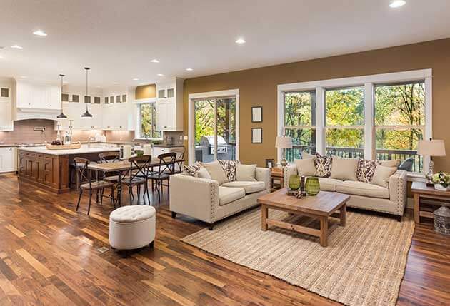
When compiling your colour palette, it’s helpful to think about your flooring. Your floor will influence your colour choices dramatically, and will impact other factors such as tones, accents, textures and artwork. Start at the bottom (being your floor) and work your way upwards, choosing complimentary or contrasting colours as you go.
5. Choose matt for the top
Always use a matt emulsion finish when painting ceilings, as gloss paint will show up all the little imperfections common with a ceiling. With gloss paint it’s almost impossible to get a seamless look, and with nothing to draw the eye away from imperfections, seamless should be your goal.
6. Settle on one tone for all
Not every room in your home has to be the exact same colour, but to unify living areas, they should at least match tonally. A feature wall can look great, but only if it ties into its neighbouring rooms. Even if your feature walls are at opposite sides of the house, clashing colours will cause havoc to the overall feel of your home.
7. Texturise
Textured paint is a great alternative to traditional paint and can add an extra dimension to your space. Ranging in thickness (some can be rolled on while others will be applied with a trowel) and , they can make a wall appear like a coloured render with subtle tone variations or offer a silky, suede or stone effect with minimal fuss.
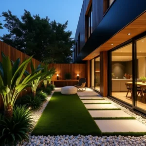
8. Bring the outside indoors
Choose colour hues from your garden and bring the outdoors in – the green of a hedge, the blue of a pool, the earthy tones of sandstone. A smooth transition between indoors and outdoors makes for a harmonious setting and a larger feeling home.
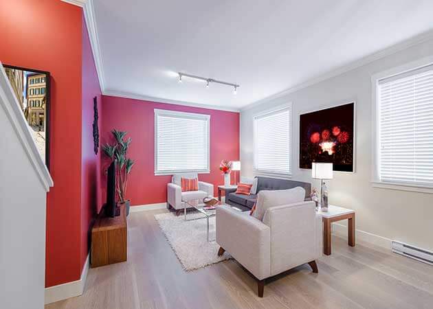
9. Balance the drama
If you’re a person with a bold personality and you love your artwork, knick knacks and brightly coloured trinkets, choose a pure white or neutral colour for your walls and ceiling to balance the drama out. Keep your walls plain and it opens you up to a world of colourful opportunity.
10. Add warmth with darker tones
Choose deep reds, browns, burnt oranges and muted yellows for living rooms and intimate dining areas. Choose darker tones when painting structural elements such as staircases, which will help these elements blend into the background. Warm and welcoming, these tones will add cosiness and charm to your home.
11. Borrow inspiration from nature
The setting around your home can influence your colour scheme – think vivid blues and turquoises by the ocean or earthy greens and browns in the bush. A front yard can inspire, as can the sun. Follow the sun and it will guide you to the right colours for your home – but remember colour requires light. A great way to allow natural light into your home without letting in any pests is to have retractable and pleated insect screens for all doors and windows. For stylish and discreet screen designs, talk to the experts at Artilux about your screening needs.
12. Aim for durability on skirting boards
Skirting boards take a battering over time, so use an enamel paint for durability. White looks good against darker or bolder colours and will help make a space appear larger. If your walls are painted a light colour, choose the same or a similar shade for the skirting boards or a darker colour for a more modern, contemporary feel.
Match your paint colours to your home’s features
Your house is your canvas, but it doesn’t start blank. Some colours are already established – an asphalt or terracotta roof, a slate patio, a blue aggregate drive, the windows and screens, the landscaping. Colours don’t have to be match but they should be considerate to existing colours, materials, and textures. Start with what’s already there and you can straight away discard certain colours that will clash. The less colour options you have, the less confusion you have.